Fiery and Icy
Crafting a healing experience of good food and good company.
Timeline: Oct–Dec 2022
Role: UX/UI designer, illustrator, animator
Tools: Figma, Procreate, Unity
Team: Jaeha Yi, Amy Jiang, Marrin Nerenberg, Ali Marzoughi, JC Sun
About the game
Fiery and Icy is a 2D cooking simulation game developed in 7 weeks in UC Berkeley’s student-led game development course.
Cook dishes with the help of your overly affectionate fire puppy, Fiery, and your ice cat, Icy, navigate the kitchen with your ninja moves, serve up sage life advice to your troubled customers, and build up your recipe repertoire.
As the only artist and UX/UI designer, I was responsible for defining our visual direction, creating artwork, UI, and animations, and conducting research, synthesizing feedback, and aligning game mechanics with player expectations.
Video trailer for Fiery and Icy. Edited by Jaeha Yi.

PART 01
Getting started
Taking inspiration
To define our direction, I analyzed Overcooked 2 and Stardew Valley, 2 popular games in the cooking simulation and cozy life management genres.
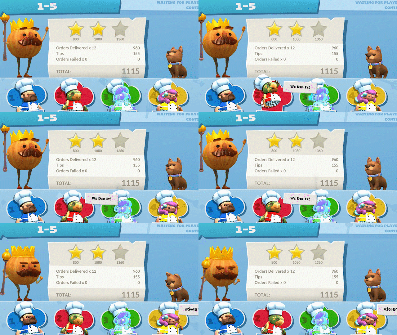
Overcooked 2 – notoriously stressful
Thanks to short level timers, a quantitative star rating system, ambiguous NPCs, frenzied, fast-paced music, and an additional element of cooperation, Overcooked 2 rewards accurate and efficient gameplay.
Since we wanted to design a laid-back experience, we took an opposite approach:
Instead of a strict level timer, we settled on a day-night system to indicate the passing of time, allowing players to mostly play at their own pace.
Instead of a quantitative rating system, relationship levels with NPCs measure progress and reward players by unlocking new recipes at higher levels.
Instead of ambiguous NPCs, unique NPC “regulars” would allow players to slow down and enjoy interactions outside of cooking.
Instead of fast music, calm melodies set the tone for a soothing experience.
Stardew Valley – engaging repetition
Stardew Valley, famous for their cozy, narrative-driven gameplay, uses natural color palettes and pixel art to set a friendly atmosphere, simple animations and dialogue to flesh out characters, and rewards consistent effort, motivating players to continue despite repetitive gameplay.
Taking inspiration from Stardew Valley, we:
Selected warm, saturated shades to create an inviting atmosphere.
Indicated NPC satisfaction visually through emoticons.
Designed unique NPCs and lovable pets, each with specific personalities, goals, and struggles.
Rewarded consistent gameplay by allowing players to unlock special recipes and stories at high relationship levels.
Defining the core loop
Now that we had a better idea of the components we wanted to include, we started working on the core loop of the game – cooking and serving a dish.
To get everyone on the same page and identify the art and UI assets I needed to create for each scene, I diagrammed the core loop flows:
For generic NPCs:
For unique NPCs:
Next, it was time to work on the basic art assets so that we could test out the basic mechanics and controls of the game, such as moving, picking up and putting down ingredients, and interacting with the pet AIs.

PART 02
Digging in(to) the game
Timeline Overview
Created concept art and art direction
Started on player, pet, ingredient, and environment tile sprites
Started implementing player movement and clicking
Internal feedback session
Week 2 (Ver. 1)
Created drafts of UI
Completed first version of sprites and tiles
Implemented dialogue, NPC AI, and recipe book
Playtest session
Week 4 (Ver. 2)
Designed UI, style guide, and refined artwork
Improved movement and item placement
Implemented cookbook and pantry UI
Playtest session
Week 5 (Ver. 3)
Completed animations
Polished UI, environment, and sprite art
Developed final character stories and dialogue
Implemented day-night cycle, audio, hover animations
Final showcase
Week 7 (Ver. 4)
Version 1
Getting the basics down
For our first prototype, we created the base layout, separating the cooking and dining areas. For the playable character, we liked the idea of a young chef offering a fresh narrative perspective from a child's point of view, so we ran with the younger version.
Initial concept art for the main playable character and his two magical pets.
The general layout of our game. Placeholder tiles were quickly placed and adjusted with Figma auto-layout.
Post-tile implementation. Internal feedback indicated that this didn’t look “playable”:
“Players need to interact with the counters a lot, but they blend into the environment and it doesn’t look like you can interact with them.”
Next, I focused on creating more sprites and updating the environment, while the devs implemented mechanics and more artwork in preparation for our first playtest.
Version 2 – Learning
In Fiery and Icy, players mainly interact with objects through mouse clicks. This includes picking and and putting down ingredients, opening the pantry, talking to NPCs, and progressing through dialogue. In our first playtest, players were able to navigate the basic game controls easily:
Testing basic interactions
“It’s pretty good, and I think the controls are good and intuitive. Looks really promising so far.”
“I feel like there might be too much clicking involved...”
Although there was mixed feedback about clicking fatigue, we focused on tuning our more complex controls in later versions due to time constraints.
Testing interactions with Fiery and Icy
Our fire puppy, Fiery, and ice cat, Icy, are key characters that facilitate the player’s cooking process. To heat up an ingredient, players must lead Fiery to pounce onto an ingredient, and to chill an ingredient, players must utilize Icy.
Unfortunately, this was unclear, and players found themselves trying to (unsuccessfully) avoid them at all costs:
“Frankly, it’s relatively hard to dodge them due to how fast the AI can be without warning.”
“I think right now Fiery and Icy are too aggressive and often get in the player’s way. ”
Testing special movement skill – kawarimi
Aside from controlling basic movement with WASD keys, we also designed a special skill called kawarimi that would allow players to move across the environment quickly. By right-clicking, the player can throw a ninja blade at an object and immediately swap places with it. Playtesting indicated that players need more incentive to use kawarimi over simply moving normally:
“Since it’s not something I associate with the genre I wouldn’t think to use it. Maybe with some clever level design you could get the players into the habit of using it.”
“I think it’s interesting, but it might need more use cases.”
Fleshing out the environment
“It’s easier to see the counters now, but it’s not clear which counters are occupied and which are “available” to interact with.”
After getting feedback from Version 1, I made the colors of the counters lighter and added wooden wall tiles. However, lack of clarity was still an issue:
“It’s kind of hard to see some objects, like the plates and food.”
Planned changes
After this playtest session, we decided on:
Tuning the aggressiveness and speed of Fiery and Icy’s AI.
Incorporating the teleportation skill kawarimi into the core gameplay more by implementing a temporary stun if players don’t dodge Fiery or Icy’s advances when they are empty-handed. To maintain low-stress gameplay, we rejected options like decreasing an HP bar or ruining food quality.
Adjusting the art and toning down the environment to improve on clarity and strengthen the visual direction.
Version 3 – Tinkering
Clarifying Fiery and Icy attacks
Now with the AI’s speed and aggressiveness adjusted, players were more receptive to Fiery and Icy. However, the timing of their attacks didn’t line up with player expectations, with players expressing frustration and confusion:
“I didn’t really understand when they were going to attack and when they weren’t?”
In this version, players understood that getting attacked by Fiery and Icy now meant that they got stunned, and used the kawarimi skill to avoid those attacks much more often.
To activate kawarimi, players must throw their ninja blade at another object to swap with it. However, it was unclear which objects were targetable and where exactly the blade would be thrown to:
Clarifying kawarimi trajectory
“It’s hard to tell where you’re aiming at until after you throw...”
“Some visual indicators of what you’re allowed to swap would be good!”
Increasing art contrast and simplification
After some solo exploration, I decided to redo the art assets in a simplified style to reduce visual noise and allow players to focus on the gameplay. This involved:
Adding borders to all objects that could be interacted with, such as counters.
Decreasing the amount of texture in the environment.
Limiting the color palette across all assets.
Changing color of floor tiles in cooking area to highlight the counters and pets.
These changes proved to be extremely effective and well-liked:
“Cute! Approachable!! Reminds me of a mix of Diner Dash game play and Animal Crossing vibes.”
“Definitely so much clearer!”
Designing immersive pantry UI
Now that most of the artwork was good to go, I was able to focus on designing the UI for the recipe book and pantry overlays.
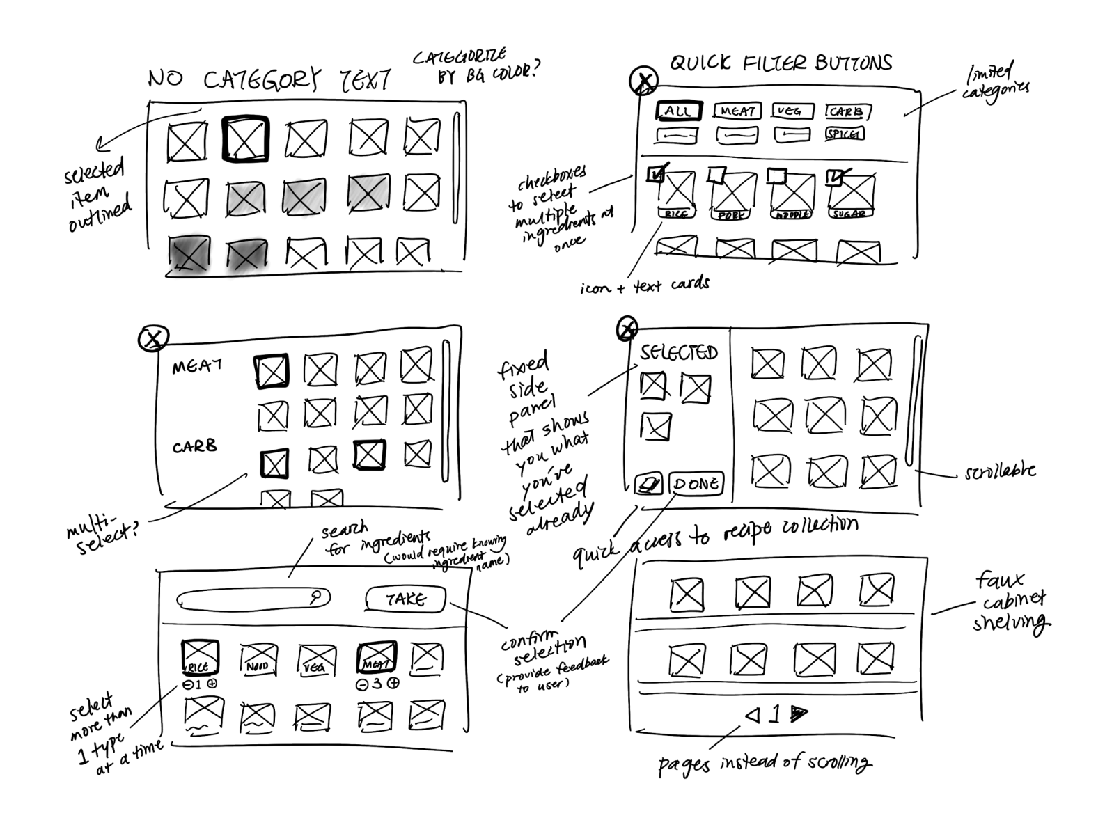
Players retrieve ingredients from the pantry. To enhance immersion, I made the pantry a physical object that players could interact with. After physically going to the pantry, players select ingredients from an overlay.
For the sake of time, we implemented the simplest idea: ingredients presented in a scrolling grid:
Designing accessible recipe book UI
The recipe book stores recipes that players collect over time, and lists the ingredients required to complete a recipe. Because Fiery and Icy isn’t a memory game, I placed the recipe book button on the screen where players could access at any time while playing.
To maintain a consistent look and feel through all elements of our game, I created a UI and art style guide for both myself and my teammates to refer to while implementing assets:
Streamlining handoff
For our final version, we decided to prioritize these changes alongside general quality-of-life improvements:
Visually clarifying when Fiery or Icy is targeting the player.
Animating movement and kawarimi throwing direction.
Highlight borders of objects players are interacting with.
Planned changes

PART 03
Final evaluation
Version 4 – Refining
7 weeks in, it was finally time for the final showcase. What did players think of our game?
Clarifying Fiery and Icy attacks – a success
To show when and where Fiery or Icy would be attacking and allow players time to react, we added visual indicators and a predictable “wind-up” unique to each pet.
This differentiation in behavior also gave Fiery and Icy a lot more personality!
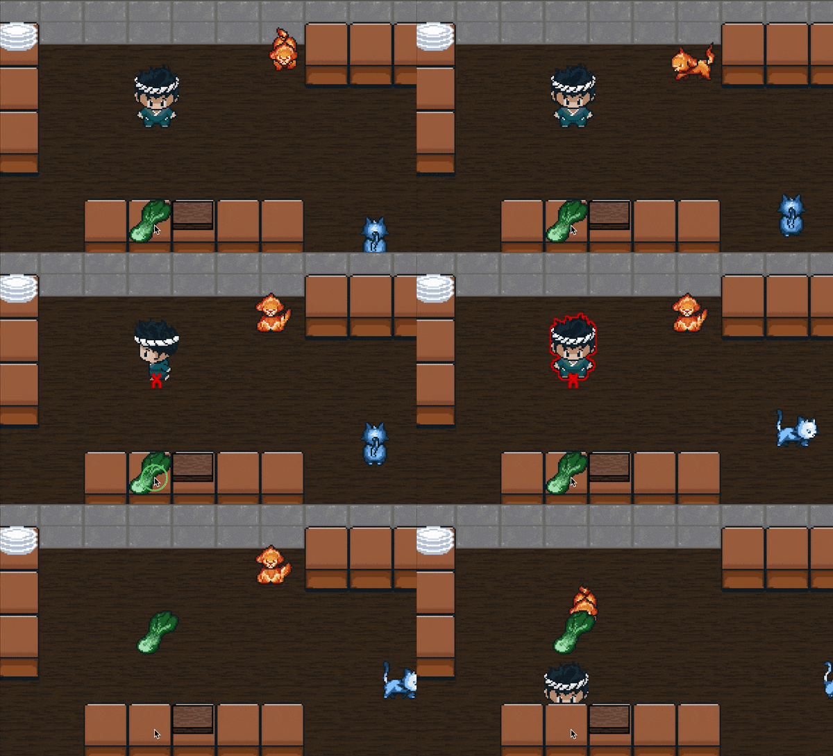
Enthusiastic Fiery pouncing on the red X mark. Players are outlined in red when in range.
Standoff-ish Icy tracking and stunning the player if they don’t move away.
Players appreciated these new indicators, and expressed interest in seeing different effects from Fiery and Icy, such as food burning if Fiery runs into it multiple times.
Clarifying kawarimi trajectory – a success
We introduced animations to indicate movement and throwing direction, allowing players to accurately predict their trajectory of movement.
Unfortunately, we didn't have time to implement a visual indicator showing which objects were in range and available to swap with. If this project were to continue, implementing this would be a high-priority update.
Swapping places quickly with kawarimi.
Dodging Fiery’s attack with kawarimi.
Now that using kawarimi had a clear purpose and was more in line with player expectations, players really enjoyed using kawarimi to teleport around:
“I think Kawarimi is a really clever mechanic!”
“Kawarimi is great, big fan of the mechanic”
“Teleporting is hot.”
Polishing the atmosphere and characters – a success
To give Fiery and Icy a bit of extra immersion and realness, I added large windows and exterior backgrounds. Sadly, we weren’t able to implement all the characters and stories that we had written in time for the final showcase, but players enjoyed their experience nonetheless:
“Fun, beautiful art and warm.”
“It’s a super cute game and I adore the graphics.”
“8-bit overcooked with some extra *sauce*”

PART 04
Wrapping up
Balancing immersion, clarity, and functionality is hard.
3 takeaways from this project
Especially on limited time, it’s far too easy to keep an idea that’s already implemented early on, even when better solutions might exist. Although visuals are important, I should have focused on designing intuitive interactions with placeholder assets earlier on, instead of trying to nail the art first.
Experiment more!
As the creators of the game, we know how the game is “supposed” to be played. However, our players don’t. Without our playtesting sessions, it would be impossible to clearly identify and isolate the specific mechanics that require fine-tuning, or even a complete overhaul.
Playtesting is key.
We intended for Fiery and Icy to be an immersive, narrative-driven experience. However, the vague narrative direction that we took early on directly translated to vagueness and confusion in our game mechanics as well. If we had set up our narrative earlier, it could have guided our design purposes and decreased player confusion on mechanics like kawarimi and pet interactions.
Let narrative drive functionality.
If we were to work on Fiery and Icy more…
A non-comprehensive list of improvements we would make
High priority
Add text labels to the ingredients in the pantry
Implement target and range indicators for kawarimi
Test UI navigation patterns and preferences
Medium priority
Implement more characters and dialogue
Food quality and customer satisfaction features
Add ambient sound effects
Add safe zones (places where Fiery and Icy can’t corner you infinitely)
Low priority
More NPC designs
Accompanying pets for the NPCs
Restaurant customization and upgrades


